Sydney 11.23
24°

Industry
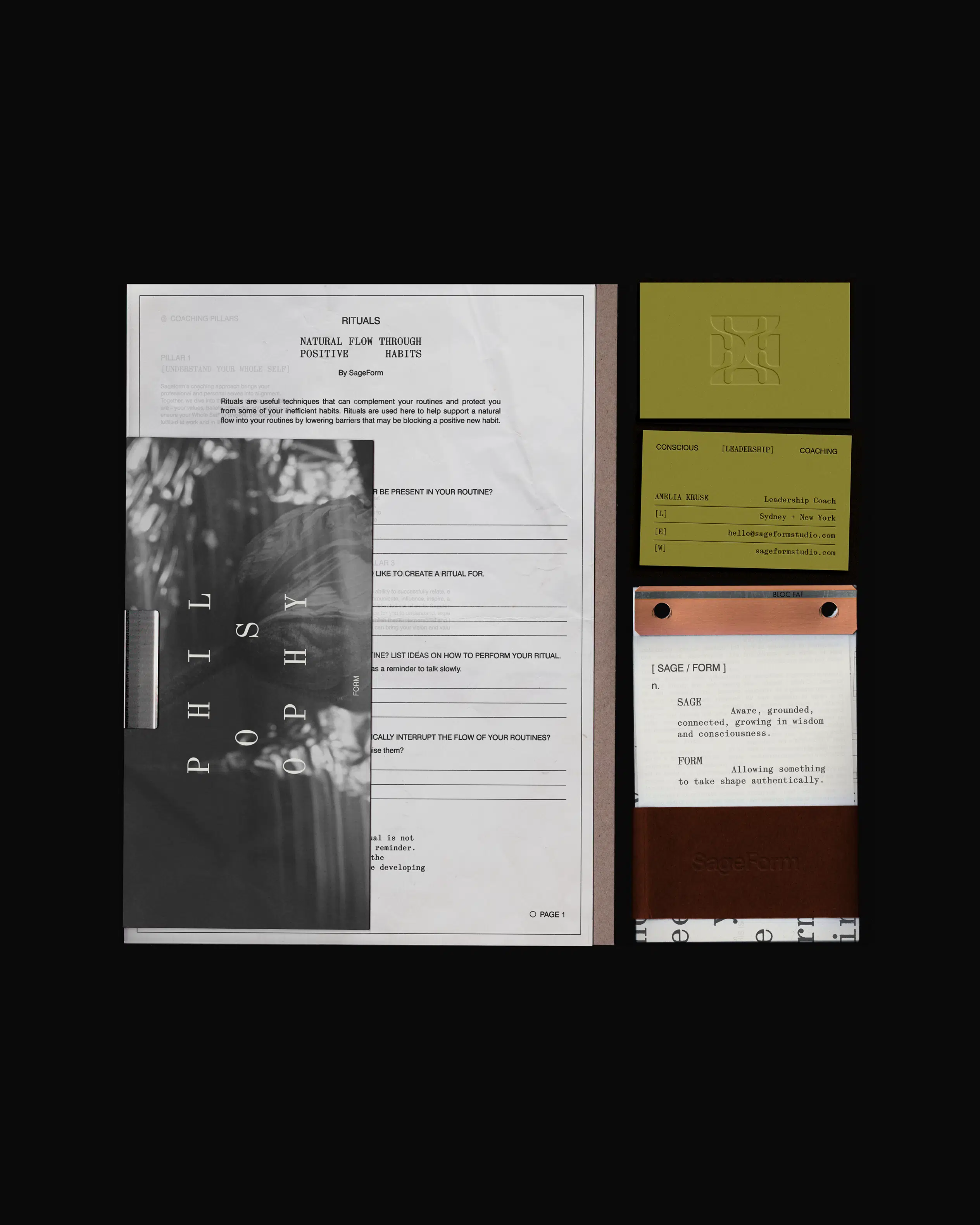
Colour in design is all about inducing emotion and adding layers to a brand’s story, pushing it into a new dimension.
Our resident colour queen, Brooke, gives some insight into why colour is important in design and what we consider when choosing palettes for brands.

As a designer, I like to push projects into places that may not have been considered, I want to take risks and explore design through a unique lens; colour is just one of many tools that is considered in that process. Colour is a tool we use to communicate a brand’s message and story, resulting in a unique and cohesive mindset, mood and feeling.
Colour can convey everything from a sense of calm to a feeling of happiness or even urgency, so it’s a key piece to the puzzle for brands to cut through the noise and stand out among their peers.
When I begin a new project, I love to dive deep into exploration, look at what colours and tones are being used within the industry and try to evolve something that might break the “norm”.
With an infinite amount of colour combinations and an overload of inspiration at our fingertips, it’s important to identify our audience and try to understand how they would react to particular tones. Humans make snap decisions based on colour alone, so it’s important to select the right colours with a particular group of people in mind.

Share